The Challenge
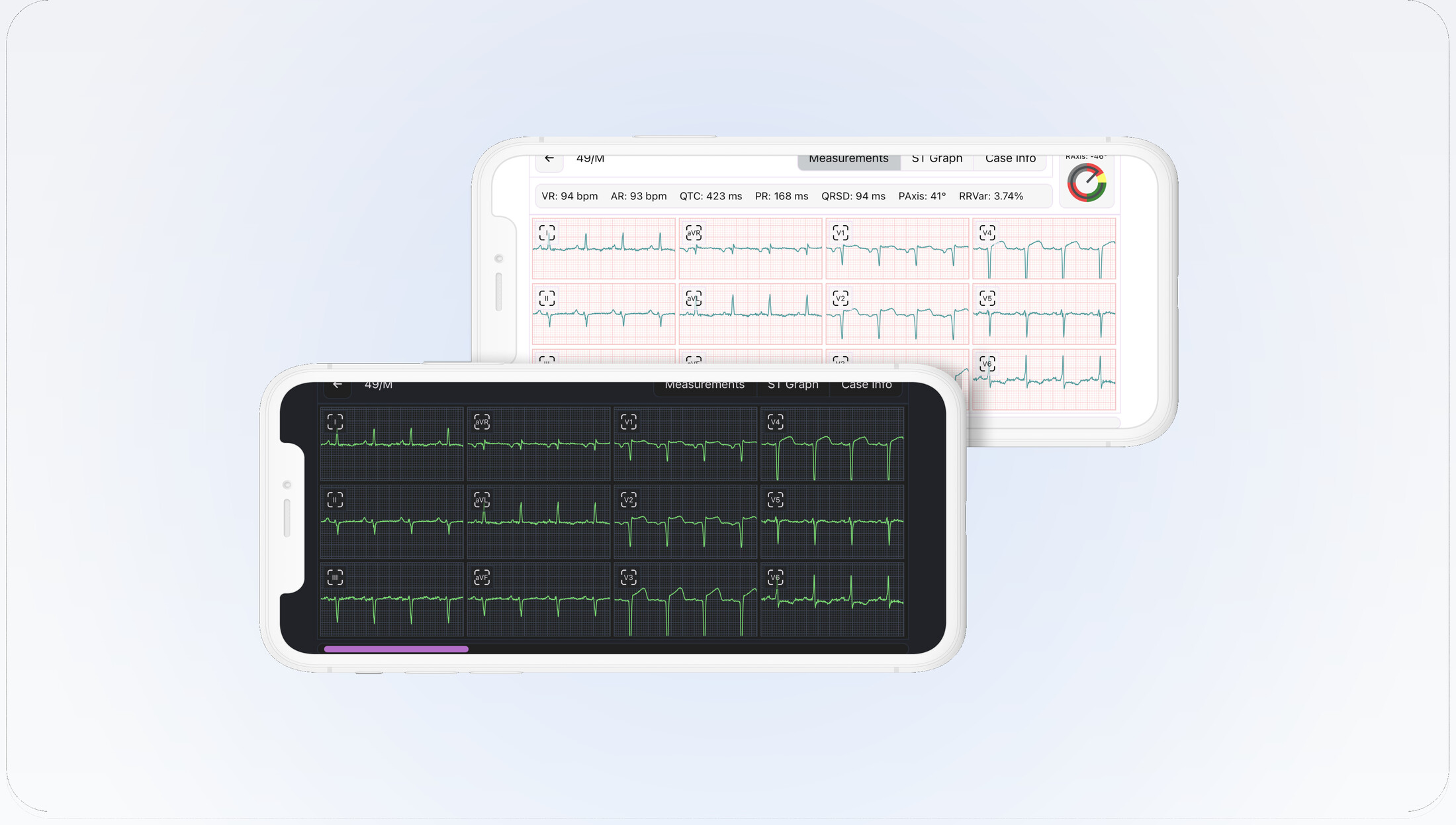
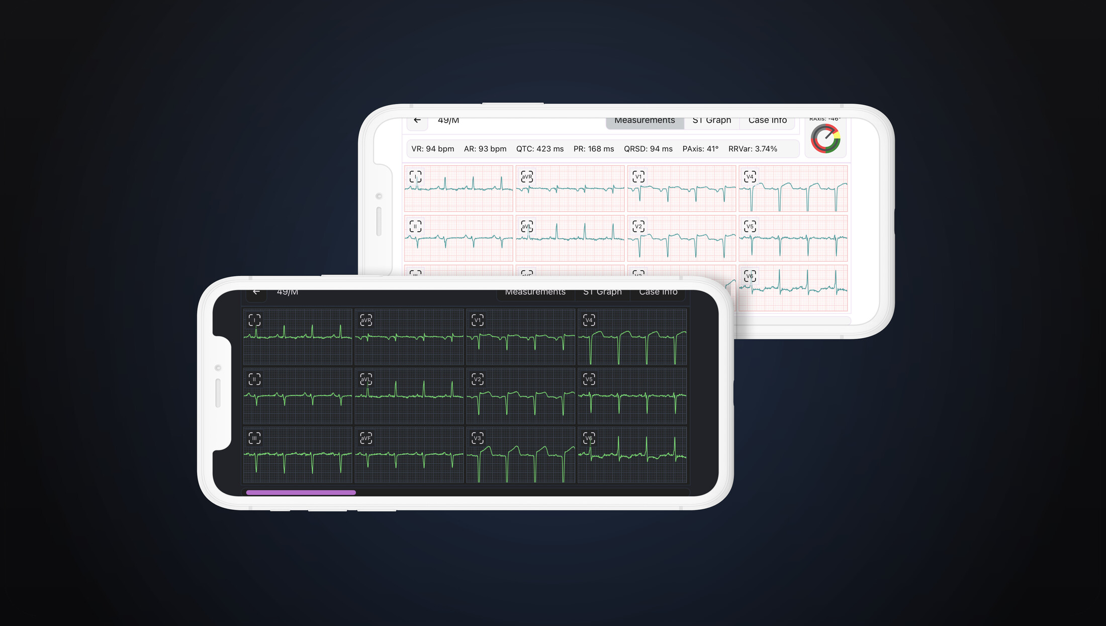
A highly efficient ECG atlas viewer is available on a moderately big screen. However, the big screen is not always accessible. Doctors want the efficiency of the web viewer and accessibility of the mobile application.
Workflow improvements for the viewer considering IEC 62366 and 62304.
Introduce a New Caliper tool for manual measurements based on the inputs from Standard guidelines such as ASE (American Society of Electrocardiography), ESE (European Society of Endocrinology), ACC (American College of Cardiology), etc.
Key Objective
Tricog is attempting to re-evaluate a user's time and efficiency. It enables doctors to diagnose ECGs Accurately and at high speed using their smartphones.
Solution
Brought in the ECG Viewer from the existing desktop application, with a new and elegant design for mobile. This interpretation model on smartphones allows doctors to diagnose cases accurately and at high speed using their smartphones.
Role: Product Designer
Tools: Figma, Invision
Timeline: 4 months (September 2021 – December 2021)
Design Process
My UX design sprints are all centered around the double-diamond technique. I believe research and testing are crucial to delivering a successful project for the user. We use an iterative process to solve identified pain points, from quick low-fidelity wireframes to MVP (Minimum Viable Product) prototypes.

Ideation
The team and I explored problems within the diagnosing technology market. Due to my decade journeying in the marketing and product sphere, I was able to guide the conversation professionally.
After keying in on the problem statement in the market, we decided to explore and hunt for solutions regarding interpreting ECG on the mobile viewer. Our solution was specific to interpreting the ECG and considered how Tricog could find a way to give time and maintain accuracy and efficiency to the user.
Once we developed this intention, I drafted a UX Design Playbook. I proposed a timeline and strategy to help meet mobile viewer needs. We collaborated on how we would integrate their previously developed web technology into mobile B2B needs.
Research
My first step in this project was to learn about Electrocardiography and how it is used to diagnose cases. Next, I conducted interviews with doctors, which was a bit different from the norm.
The doctors wanted a quick and accurate interpretation and an easy workflow with the customized viewer to help them assess their cases quickly.
Style: Remote Testing via Google Meet
Number: 7 Doctors interviewing
Duration: 30 min
User Interview: Doctors
My empathize stage included interviewing the doctors individually to understand better what they wanted. To do this, I chose a series of four questions that were qualitative and quantitative.
- How was the experience of using the viewer? Did you find any difficulties?
- What is the most important thing you always look for when you interpret an ECG?
- How frequently do you use evidence while adding the observation statement?
- What other functionality would they like to see to help them better interpret ECGs? Is there any feature that we missed adding?
Problem Statement
Dr. Aryan is a busy cardiologist and parent looking for a solution that allows him to balance his personal and professional life without losing their accuracy of work.
Hypothesis Statement
If Dr. Aryan had used the Tricog ECG viewer, he would have easily balanced his personal and professional life without losing accuracy in interpreting the case. He will be able to spend enough time with the family.
User Interpretation Journey
The experience of ECG interpretation begins with an understanding that having an ECG Viewer is a crucial part of diagnosing at Tricog.
Throughout the journey, we educate doctors about the viewer and bring awareness towards their balance. We also guide them to use the viewer and avoid action.
Our key strategy is to encourage doctors to return to an accurate interpretation and ensure that doctors don't miss anything as they can't afford mistakes.

Understanding the Competition
When evaluating the mobile viewer problem statement, I studied two main verticals encountering the potential technology. These were ReadMyECG and ECG Pro - Real World ECG / EKG.
I also conducted formal Market Research, SWOT Analysis, and Competitive Analysis. I then drafted a paper considering the merit of the data and let the evidence guide the primary research methods.

Competitive Audit Report
In this competitive audit, I aim to identify my key competitors and review the products my competitors offer.
I look at their visual layout and navigation, what custom features they offer, what standard features they offer, and how they handle the customization.
I also examine what the competition does well and what they could do better, searching for their strengths, weaknesses, gaps, and opportunities.
Gaps
- How might we design a fully automated system to identify measurements and tools for manual measurements?
- How might we help user to customize their navigation based on their preferences?
Opportunities
- The priority of this viewer is to structure and organize the easy workflow so that the focus will be on the interpretation workspace. With this in mind, it could have customization for the workspace.
- Have a tool that doctors can use to add, remove or edit the measurements without having any distractions.
- Incorporate different graph styles allowing users to review all the multiple views of the leads.
Information Architecture
The information architecture was designed to organize the ECG viewer's features into a clear, intuitive hierarchy — ensuring doctors can navigate between leads, measurements, annotations, and patient data without cognitive overload.

User Testing Findings

Key Notes
Main Finding: Because of the lack of diversification in the information, alternative uses or a unique offering to the viewer would stir the pot in one way or another.
Other findings include:
• Important information is not favoring the user because of the wrong placement of the component
• On all screens, patient data is unclear
• Calipers aren't easy to handle
• Bottom navigation is not accessible as it gets hidden by hands
• Overlapping information is creating confusion for doctors
Final Designs
- Clear Navigation — We ensured doctors know what they are navigating and how to get specific information. Clear messaging of any changes reaches the doctors immediately.
- Flexible Measurement Tool — Ensuring doctors understand where they are drawing and how they can store measurements. At any time, doctors can discard existing drawn calipers and draw new ones.
Accessibility Considerations
I ran my colors through the color interface tool in Huetone.ardov resources, and ensured that all my colors passed by WCAG3 Accessible Perceptual Contrast Algorithm (APCA) guidelines.
I ensured that my texts, buttons, and icons were of appropriate sizes to be easily legible, no matter what mobile screen size a doctor uses.
Takeaways: Impact
I received positive feedback on both my usability case study and high-fidelity prototype. That reflects that the design of ECG Mobile Viewer is usable and meets the user's needs. This helped us onboard 380+ customers worldwide, including the Philippines, Africa, Malaysia & India.
A quote from peer feedback:
"Fully automated measurements and multiple calipers will help our doctors to interpret the cases faster and easier."
Takeaways: What have I learned?
While designing ECG Viewer for the mobile app, I learned that not only extensive user research but strict attention to design guidelines (IEC 62366) also plays a crucial role in the UX design process.
Business Impact

Next Steps
- This design could be a huge undertaking to develop all the mobile and web screens. So my next step would be to work on the web version for Electrocardiography with other listed times, such as incorporating an ST Graph and the ladder view for the case.
- I would likely need to conduct more user research into the complexities of security. For example: gathering the insights I need to make the patient feel comfortable giving out personal information.