Almost every day, we go through the login process. Despite being so common, login interactions are also the most challenging to design. An unresponsive login can block visitors' paths and affect their further experience. It's important that your login page does not cause your users any difficulties.
Registration benefit
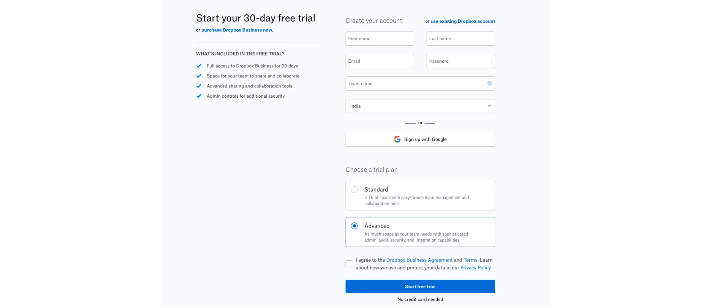
Most users do not want to register. They need a compelling reason to register and an easy registration process. The title of the form should include a description of what the user will do after clicking on the submit button. In place of the "Submit form" choose "Create account", "Get started," or "Get our product". Once the user has registered and clicked the submit button, they will be aware of what will happen.
Easy-to-follow forms
The login and registration form should be visible and clear on the page. Using other elements that may distract from filling the form is not a good idea. When there are many fields on a form, you should display the milestone or the percent of completion. It helps users understand where they are in the process. Make sure that users' personal information is safe when they register.
The submit button can be disabled until all required input data is filled in. Checking the submitted data this way is a good way to ensure accuracy.
A good practice is to save the user's data when the user has left the page, and substitute it when they are back. So, they don't have to re-enter all the information if something goes wrong.
Show Input text fields
In a website or app, logging in is a necessary step to interact with the service. It should be the most prominent feature on the page. A user shouldn't have to go through any extra steps to log in.
If the first field is an email field, the user will be able to focus on it immediately if the automatic focus is enabled. By doing this, you can start filling in right away and save time and effort. This will enhance the possibility of completing the registration.
Having each field display the data entered by the user is good. Tooltips, field masks, and placeholders can help users avoid form-filling errors. Filling out forms becomes simpler and more efficient.
There should be a visual sign of the state of the field: whether it is active, unavailable, filled in, it has an error. This communicates to users the state of each field.
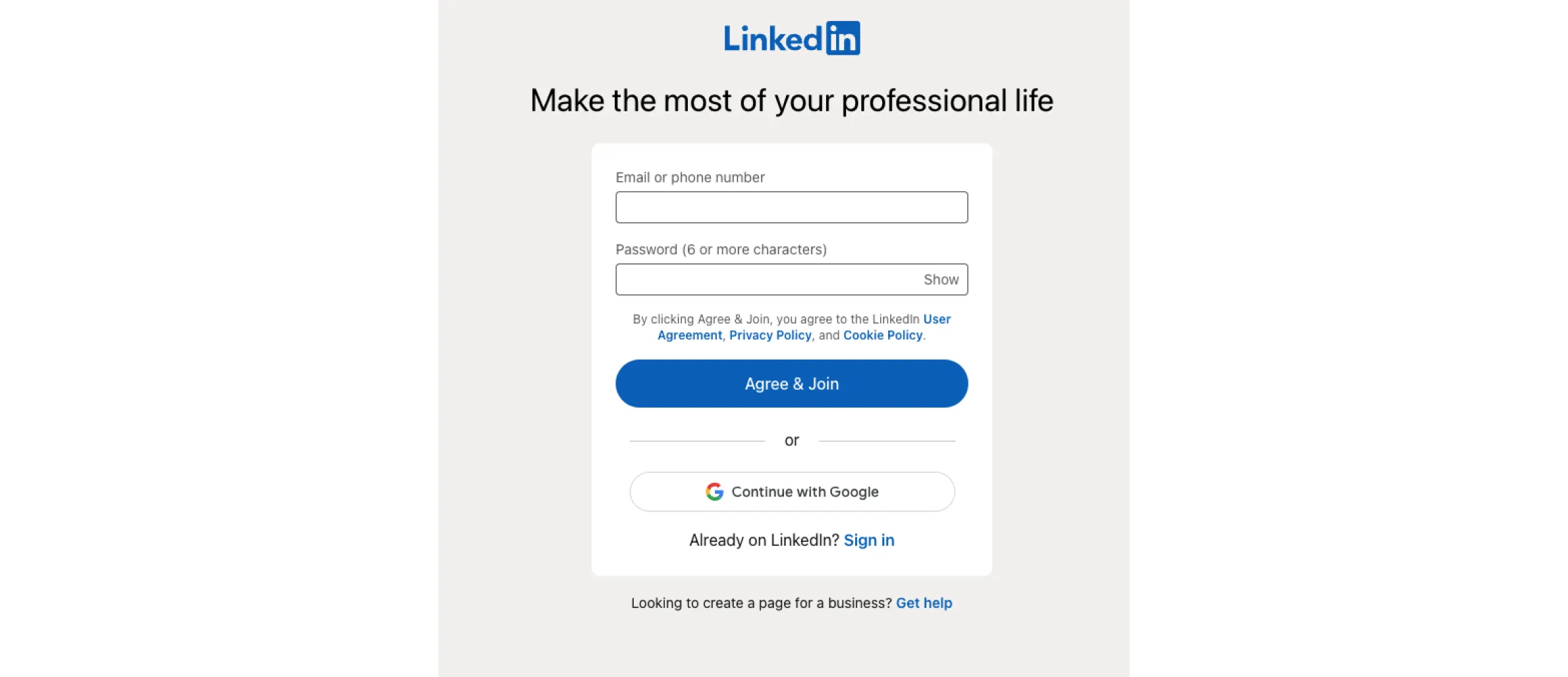
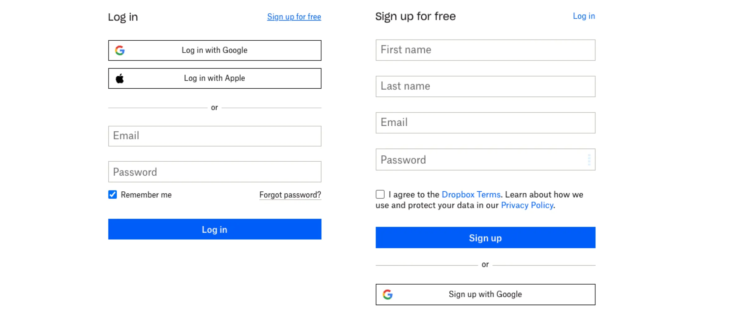
Don't Use 'Sign In' and 'Sign Up' Together
'Sign In' and 'Sign Up' are quite close. When buttons look too similar and both use the same verb in their labels it's pretty easy for users to get confused. Users might click one instead of the other, and this can frustrate the users who already have an account.
Users shouldn't have to pause and think about what button should they click. If you want to provide a good user experience in login, avoid using 'sign up' and 'sign in' together. To differentiate the buttons, use different verbs in labels and different visual appearances.
Try experimenting with the "sign up" button that gives, compels, and is tied to your product. This makes it less likely to be overlooked.
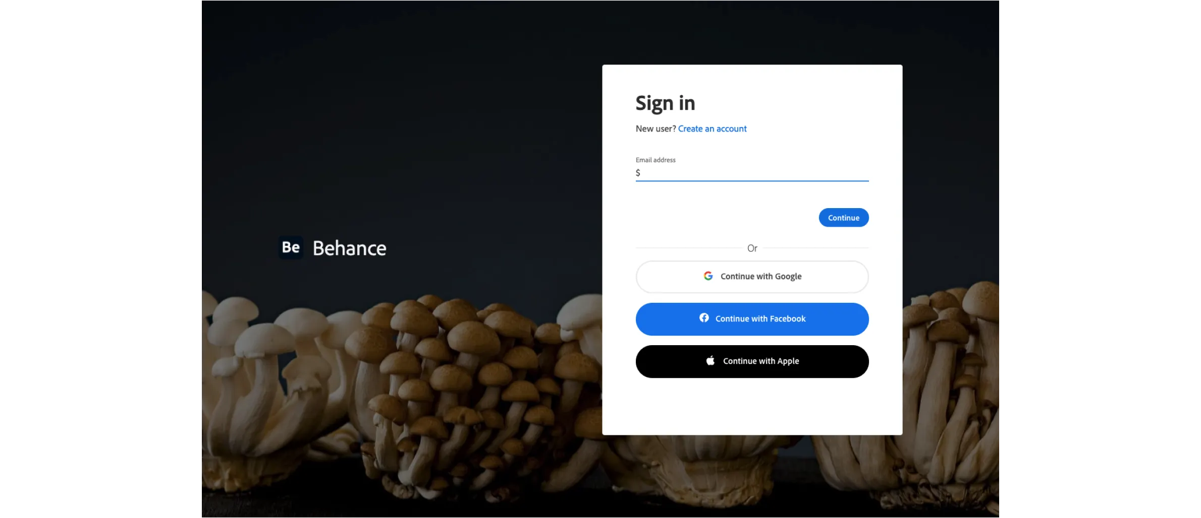
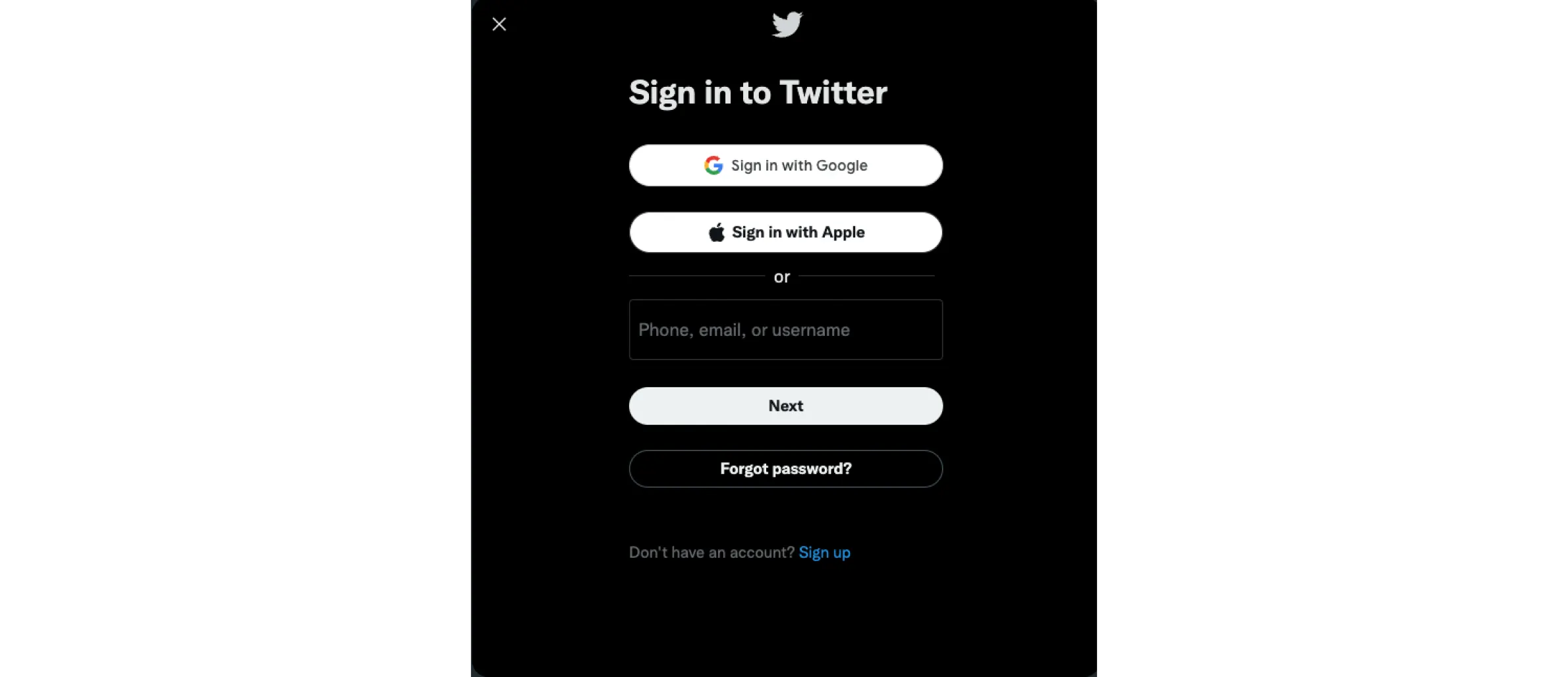
Allow users to Login via social networks
Users are growing resistant to traditional registration processes. If you let users sign in via their Facebook, Google, or Twitter accounts, why create an extra set of login details? In comparison to the standard email registration, this can simplify account registration. But it also has its pros and cons.
Pros:
- Users don't have to fill out the registration form, to create other usernames/passwords
- Users don't have to verify emails.
- Users don't have to remember a new pair of usernames/passwords.
Cons:
- Not everyone has social media accounts. Some people try to stay away from social networks.
- Privacy concerns. Not everyone will be happy to share her profile data.
That is why social media login shouldn't be the only way people can start using your product. You should have a traditional login system running in parallel.
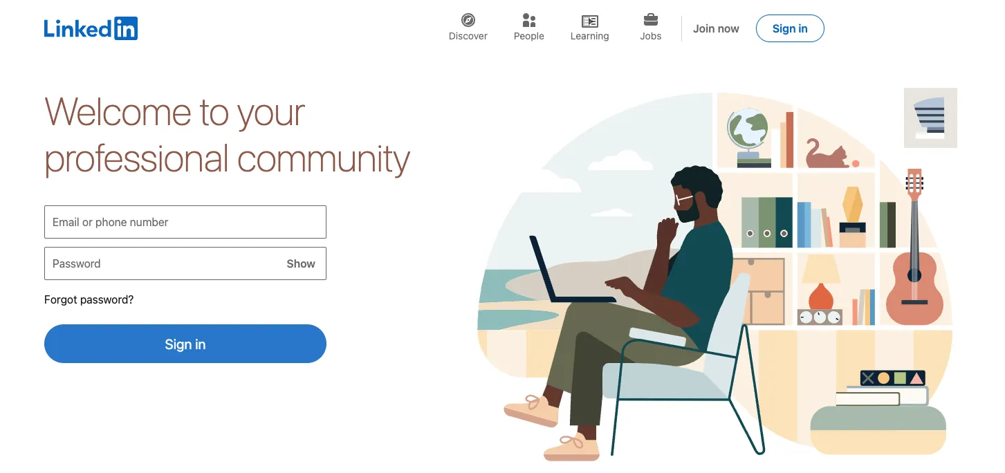
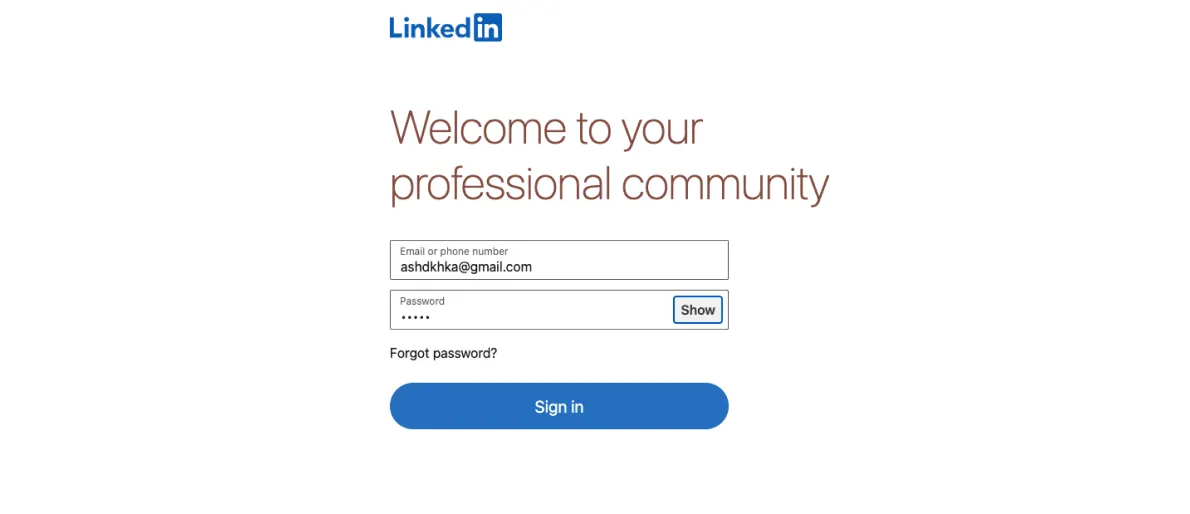
Let users see their Pa$$w0rd
Passwords are often mistyped when logging in. When the field is masked, it's easy to mistype the password. Mobile users, in particular, are prone to mistype.
Adding a password-showing feature is a good idea. This can be accomplished by placing a CTA in the password field. If the user clicks it, the password will be unmasked. On a small mobile keyboard, it's easy to hit the wrong key. This is especially useful for mobile login pages. In the field you are filling out, it should also be indicated if there are any security requirements.
Use Email Address or Phone number as a Login
People often have trouble with their passwords. It can be challenging to come up with one. Long-term recall and restoration of these memories are impossible.
Websites or apps should allow users to log in with their email address or phone number. Using fingerprint data from a smartphone or using the "Magic Link" method is the most popular way.
In case users must use a password make the process as simple as possible. Make sure the password never needs to type twice. A lot of people copy and paste their passwords without remembering them. Using the "Show password" checkbox, you can display the contents of the field instead. You can also report if the Caps Lock key is on so users will make fewer typos.
Differentiate Login from Registration
A simple registration form would work. It is a good idea to reduce the required fields if social login isn't possible. A simple email address and password creation are all you need. Information that is not essential at this point is not worth asking for.
It's very important to differentiate the registration from the login. This design will reduce the chances of users attempting to log in via the registration form.
Do not force the user to create an account name that is unique. There could be no common nicknames left, so the user would have to think of a new one and remember it. If you need a name, try using the default email address or phone number.
Forms should be validated as you fill out the fields, not after submission. By doing so, the user will receive an immediate response to the input data. Thereby improving the user experience. It is necessary to encourage the successful completion of fields. While error messages should help solve problems, not blame users.
Once authorized
After user registration, don't ask for confirmation through email. As this will disorient them from completing their original goal. And also reduce their satisfaction with the interaction. Users should start using your product as soon as possible.
The practice of switching between apps is poor UX. Keeping users out now but allowing them access later is illogical. By sending a short code, you can simplify the process even more.
It would be better to prompt users for their data so they can return it. As an example, Facebook allows you to sign in by clicking on your avatar on the login page.
Registering is a complicated system that requires many custom scripts. Designers need to consider all details of the user process and the business needs at this stage. Make login & registration more efficient, so that users can start enjoying the service. These simple techniques will increase the number of new customers.