When designing user interfaces (UI) that present diverse content in an organized and visually pleasing manner, the "bento box" design concept stands out as an increasingly popular approach. Rooted in the Japanese tradition of creating aesthetically balanced, compartmentalized meals, the bento box UI design applies this philosophy to digital interfaces, offering a flexible and user-friendly layout.
What is the Bento Box Design Concept?
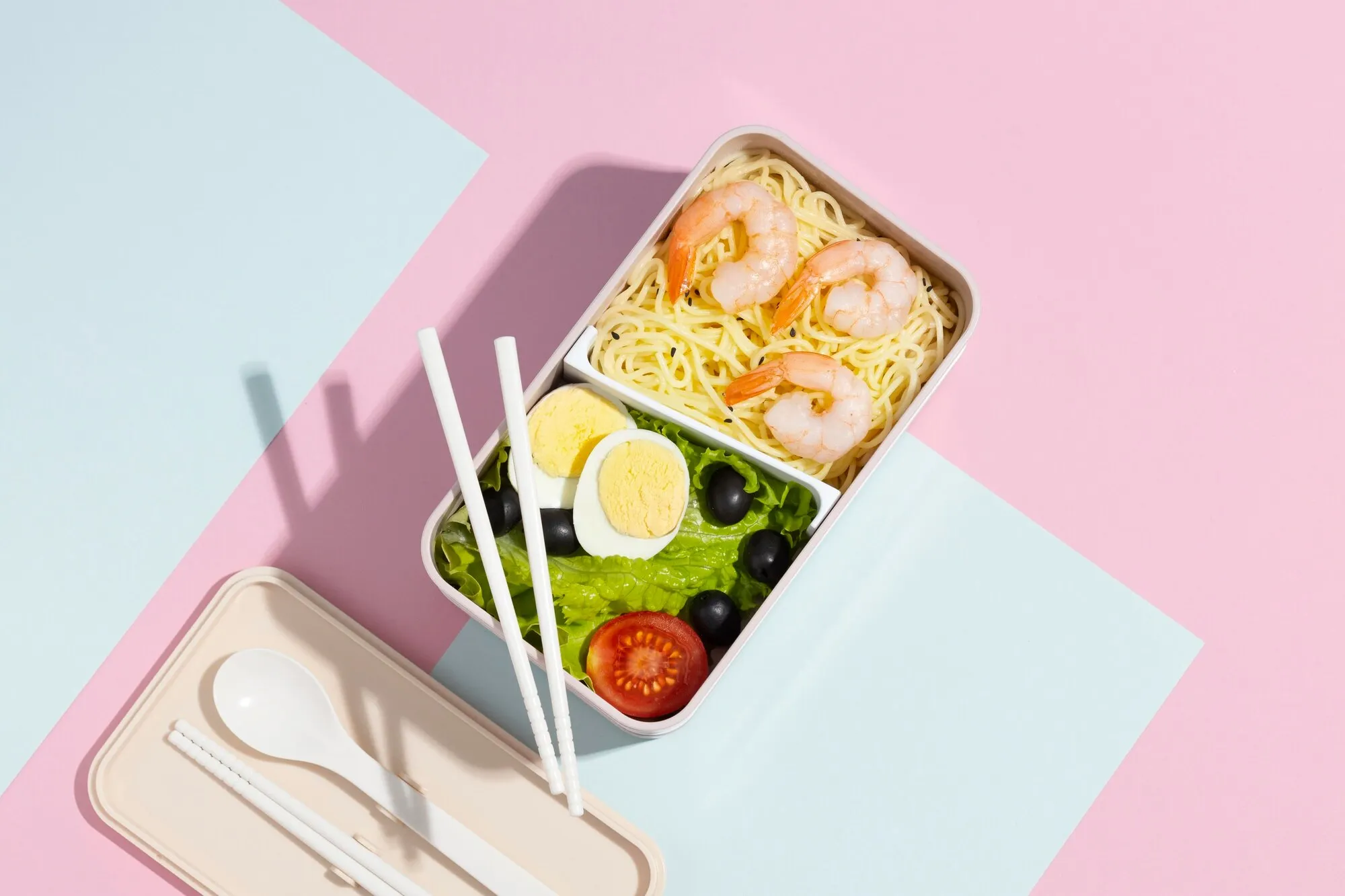
The Japanese bento, which neatly organizes each meal component in its compartment to keep everything visually separated yet easily accessible, inspires the bento box design. In UI design, the bento box design translates into creating distinct, structured sections, or "boxes," on a screen. Each box contains unique elements — such as text, images, or functionalities — allowing users to navigate complex information without feeling overwhelmed.
Characteristics of Bento Box Design
To better understand the bento box concept, let's highlight the key characteristics that make it unique and effective in UI design:
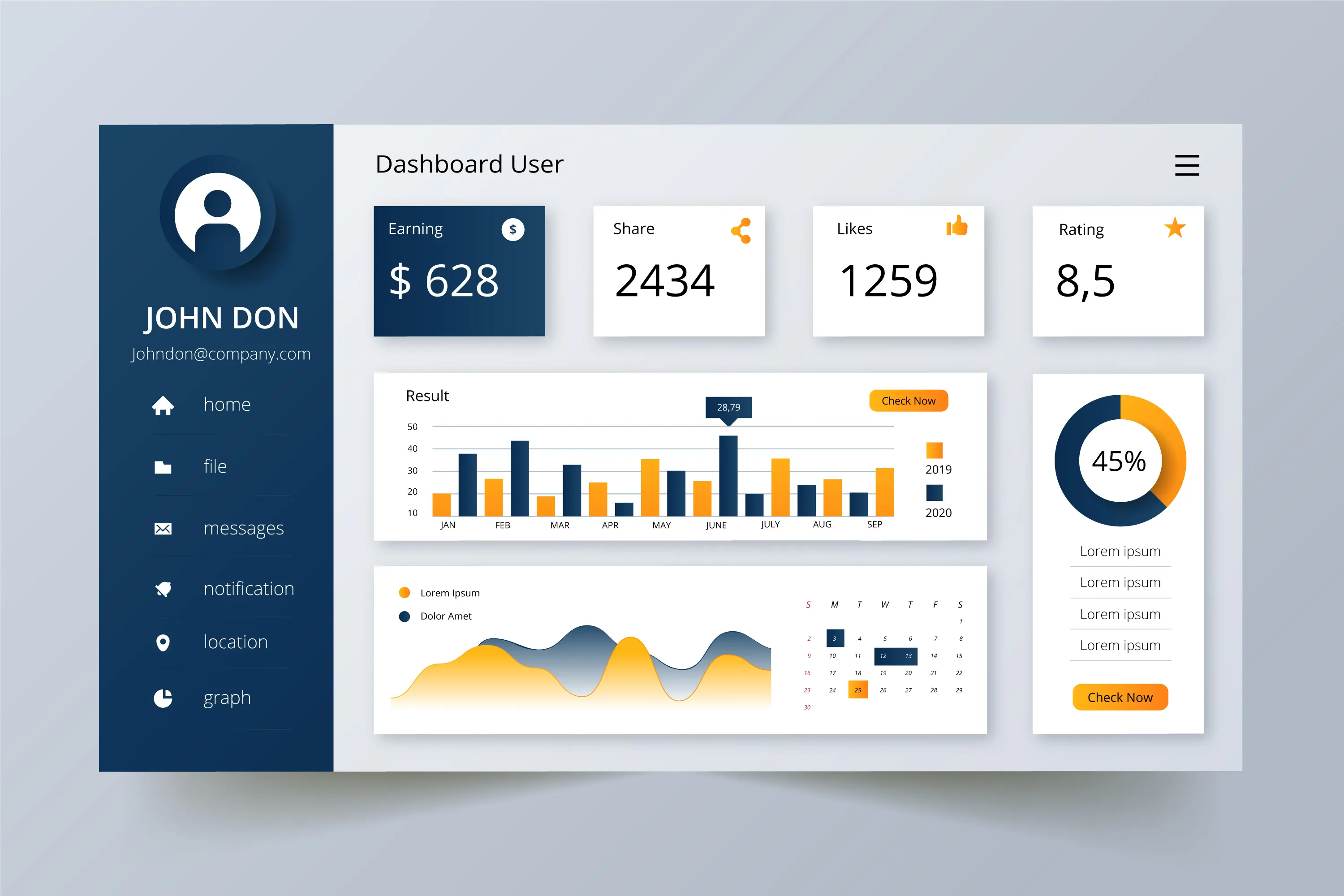
- Modularity: Different "boxes" or containers, each holding different types of content or functionalities, divide the interface.
- Simplicity: It avoids visual clutter by organizing content neatly, making it digestible for users.
- Consistency: Elements within each box maintain consistent styles, which helps create a seamless user experience.
- Separation of Content: The clear delineation of different functions or content types allows users to focus on each piece individually.
- Adaptability: This layout is responsive, often adjusting well across devices (from desktops to mobile screens).
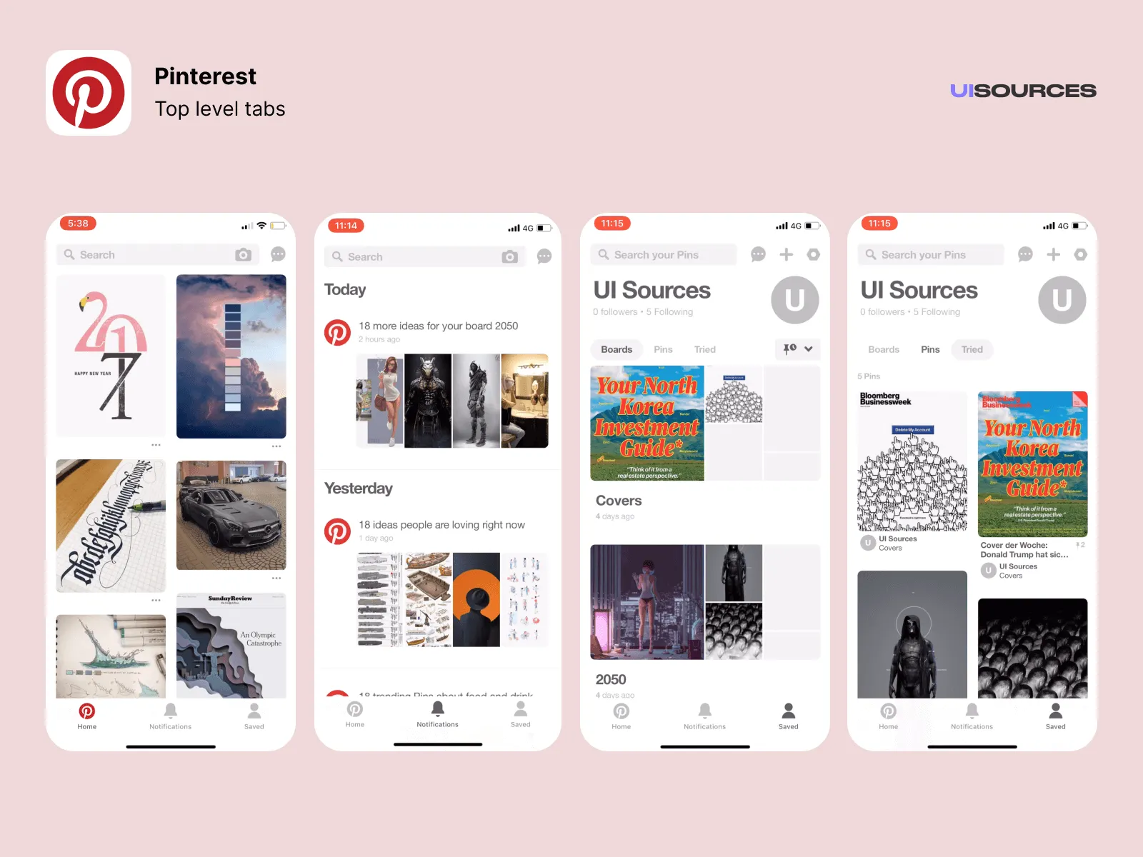 Pinterest displays images in a grid-like layout, with each post visually compartmentalized.
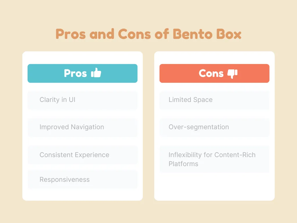
A Practical Guide to Implementing a Bento Box Design Layout
Now that we understand the pros and cons, let's explore how to effectively implement the bento box design.
Do's:
- Prioritize content hierarchy: Ensure the most important elements are easily visible and prioritized at the top of your design.
- Maintain visual balance: Use consistent padding, margins, and alignment to avoid a cluttered or uneven look.
- Be mindful of responsiveness: Ensure the design translates smoothly from desktop to mobile. Use flexible grids or media queries to adjust box sizes accordingly.
- Utilize minimalistic design principles: Since the bento box is all about organization and clarity, keep the design clean with minimal distractions (e.g., avoid excessive animations or colors).
Don'ts:
- Don't over-segment: Avoid breaking content into too many boxes. Users should still get a sense of connection between elements.
- Avoid inconsistent styles: Ensure consistency in typography, button styles, and colors across all boxes to maintain a cohesive experience.
- Don't ignore user testing: What appears clean to designers may be confusing to users. Make sure to test with real users to identify areas where the bento box layout might hinder their flow.
Conclusion
The bento box design concept offers a flexible and intuitive way to structure content on digital platforms. Its modularity and clean aesthetics allow for a user-friendly experience, especially when used on multi-device interfaces. However, as with any design framework, it requires a thoughtful application to avoid over-segmentation and ensure the layout remains engaging and practical for users.